Can you guess the past decade’s investment highs and lows?

Every year I like to review my favorite chart, the Asset Quilt. You can see why it’s named that below.
Instead of identifying individual investments that did well (or did not), the Asset Quilt ranks entire classes of investments’ results for each year. Here it is for the entire 2010s decade:
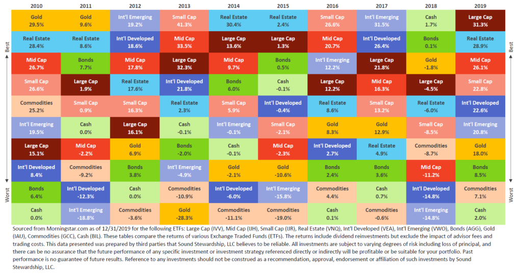
Reviewing this chart highlights several key investment points:
- It’s difficult to tell long-term performance based on any single year.
- An asset class that did the best one year could very well be in last place the following year.
- Historically, equities have produced the best long-term results, but at the price of higher volatility.
- A diversified approach that uses multiple asset classes reduces the risk from any single asset class.
Can you tell from this chart which asset classes have done the best over the past 10 years?
You may guess a few of them, but most people have a hard time figuring out long-term averages based on this view alone. Here are last year’s results compared side-by-side with results averaged over the past 10 years.
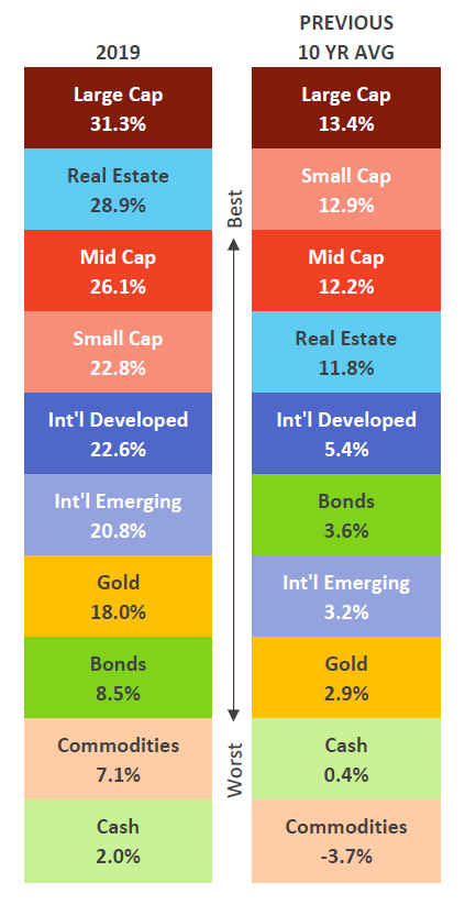
Zooming out to a 10-year view changes our perspective. You might be convinced from this view that a diversified approach is better than not, but you will most likely still struggle to identify what a diversified return would be over this period. Don’t worry; I did the math for you: A sample portfolio mixing these asset classes—with a standard strategy of 60 percent equities and 40 percent bonds—would have experienced around 6.6 percent growth annually over this decade.
The Asset Quilt makes it clear why we champion diversification, but every investor is different. As always, you should consult a professional when deciding how to invest, given your goals and financial situation.
Need investment advice? Ask one of our Wealth Advisors about developing your customized investment strategy.
< Back to Insights