Financially anxious? This chart may calm you down.

Early into 2019, the nervousness of last year is still lingering in the markets. Already this year, the headlines have been full of:
- Government shutdowns
- Trade wars
- Brexit turmoil
- Predictions of recession
We’ve noticed that increased anxiety in our work with families and their finances. Clients are approaching financial decisions with more fear lately. After a decade of strong investment returns, many people are jittery. It may be ten years later, but it seems the Great Recession is not far from everyone’s minds. In this game of investment musical chairs, no one wants to be the last one standing when the music stops. In the face of uncertainty, it can be tempting to panic.
We suggest grounding yourself in some solid investment data instead. At the beginning of each year, I get nerdy joy from getting to update one of my favorite charts.* This chart, affectionately called the “Asset Quilt,” ranks ten different types of investment assets’ performance over the past ten years. It’s a little overwhelming at first, but take a look:

Each column lists the color-coded assets from top to bottom—best performance to worst. Notice that each year’s order is relative only to the other investments in that specific year. The best thing on the board in one year may earn very little, and the worst things are sometimes slightly negative…and sometimes a lot negative. Before I share my takeaways from this illustration, what strikes your eye?
It’s not hard to see that 2018 wasn’t a stellar year. It turns out the best performing asset was actually cash! This was the first time in a while that cash has led the other asset classes.
Based on this chart, can you tell what the best asset has been over this decade? It’s very difficult to tell, and any idea you may have is most likely just a guess based on a visual scan. To help you out, here’s the chart again, but this time I added an extra row showing the average return of each asset class over the past 10 years:
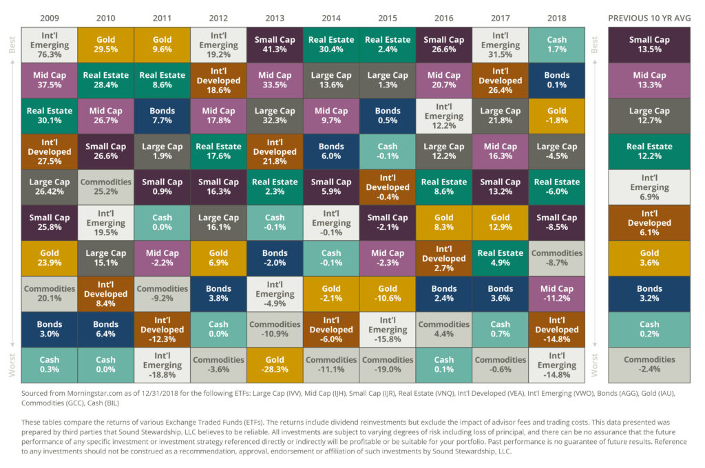
Over this particular time period, small U.S. companies did the best, averaging a more than 13 percent annual return. However, that experience wasn’t a steady, even-keeled ride. It was a fairly bumpy one, with Small Cap returns bouncing back and forth from highs (41.3 percent in 2013) to lows (-8.5 percent in 2018).
We can learn some important lessons by reviewing the Asset Quilt chart every year:
- Returns appear random in the short-term. It’s impossible to predict which investments will do the best based on how they did the year before. (Unfortunately, this is exactly how many people choose their 401k selections.)
- Investing requires a long-term focus. There are going to be crazy years, and every asset class on the chart has experienced wild swings at some point. You only make true progress over time and with patience.
- Diversification is critical. A portfolio that incorporates multiple asset classes is designed to reduce volatility, while still taking advantage of growth assets. Diversification is one of our seven core financial principles.
- Numbers can be tricky. It’s easy to be misled by data. This year’s chart in particular has a fatal flaw: The gut-wrenching losses of 2008 have dropped off the 10-year history. Because we are measuring from a starting point at the depths of the market crash, the chart—and the 10-year averages—may be painting a rosier picture than what’s realistic.
If you’re currently feeling some extra financial anxiety, you’re not alone. Take a deep breath and remind yourself that the markets may be unpredictable, but a long-term, diversified approach has proven wise over the years.
Want help crafting an investment strategy that works for your family? Let’s talk!
*Please tell me you have favorite charts and graphs, too!